Review: Pentel Slicci .25

In terms of micro-fine point pens, the Pentel Slicci .25 ranks consistently among my Three Jewels, one of my favorite “go to” pens that receives a lot of writing time. While the Uniball Signo Bit .18 is my favorite of all time (see earlier review), Pentel Sliccis rank either second or third, competing with another Uniball product (the Signo DX .28s) for the coveted silver or bronze.

Overall, the Pentel Slicci (.25 tip) is a solid and reliable pen and I think one would do well to have a couple of these in their pen arsenal. It is well-balanced and very lightweight, which makes writing with one a pleasure. Despite their weight, Sliccis are nicely durable. I always make it a habit, and count source of pride, to accidentally drop my pens immediately after putting them into use and even after a few such mishaps Sliccis have thus far emerged unscathed. Their durability (plus light weight) make them a great pen to carry along on travels.

Pentel Slicci .25 (black ink) and a Quo Vadis Habana notebook

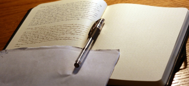
While the .25 line width isn’t as narrow as some other pens I’ve used, it’s nonetheless adequate for my tiny handwriting. And with variation in pressure once can achieve a subtle, yet noticeable contrast between thick and thin lines, which is always a pleasure for those envious of the English Round Hand style of script.

One of the nice things about the Pentel Slicci .25 line is the selection of ink colors. To date I’ve tried blue, black, blue/black and brown and have been duly impressed with color quality. Vibrancy is especially apparent with blue as well as black. I’m looking forward to experimenting with some additional colors in the near future.

The only somewhat negative element of Pentel Slicci .25s that I’ve encountered is the occasional inconsistency with ink flow. Every so often ink flow will reduce almost to the point of stopping, which of course creates problems, especially if you’re frantically trying to catch a fleeting though before it is forever lost. I suspect this may have something to do with formulation of different color inks; it’s a problem I’ve encountered with blue ink, but not with any of the other colors tried to date.

The occasional ink flow issue notwithstanding, Pentel Slicci .25s are delightful writing instruments worthy of a place in the pen cases (or for the nerds out there: the slot of honor in shirt pockets) of anyone having a use for micro-fine point pens.

Frustration of Fountain Pens

In terms of writing instruments, the greatest source of frustration for me comes from fountain pens. While I enjoy experimenting with different ink brands and colors and likewise find appealing the smooth glide of a good fountain pen on quality paper,  I nonetheless find the overall fountain pen experience disagreeable due to one important factor: even with the finest nib size, I am forced to write much larger than what feels natural for me and as a consequence the quality of my penmanship goes to hell in a hand basket. Or in this case, an ink bottle. I have found that old steel-nib dip pens are more conducive for my style of handwriting than any fountain pen I’ve tried to date. Of course dip pens are about as impractical as one can get in terms of writing instruments.

Perhaps I just haven’t found the correct fountain pen yet. I recall reading somewhere that, as a rule, Japanese fountain pens have finer nibs that European or American products. Perhaps I should give an extra-fine point Japanese model a try (am open to suggestions!). Or perhaps I haven’t stuck with the fountain pen thing long enough to acquire the skill needed to write with the exactness I’ve grown accustomed to using .28 and .18 gel pens.

While I am intrigued by the world of fountain pens and bottled inks, I disappointedly remain on the sidelines, a mere spectator of new inks and “fountain pen friendly” paper, wishing that someone would develop a “tiny handwriting friendly fountain pen.”

Habana: First Impressions

The end of summer was a dark time, marked by frustration and bitterness brought on by cheap-ass paper. Needing at that time a “carry-about” notebook, I had put back into service the pocket Moleskine used on-and-off for a portion of this year. Alas, by the beginning of September I was again over the garbage Moleskine attempts to pass off as “paper” and casting about for a suitable alternative.

While researching notebooks online one evening I ran across Quo Vadis’ Habana, a line with which I was vaguely familiar. This particular notebook caught my eye for a couple of reasons: first was the mention of Clairfontaine paper, which I’ve used previously and know of be of first-rate quality. The second eye-catching element was the size of the notebook: 4″x6″ which I’ve long considered the ideal size for a notebook, despite it being larger (and presumably not as portable) as the more common 3″x5″ size. Nonetheless, there was much potential with the Habana and the question of whether or not this notebook would prove a suitable alternative to Moleskine was soon one step closer to being answered due to the perilous ease of “one click ordering” combined with a singular lack of willpower.

The 4×6 Habana has been in my possession for maybe two weeks, but it was only tonight that I put pen to paper and began putting it through its paces. My initial impression? With the solid construction and quality paper It’s a good notebook. A VERY good notebook…

Habana notebook (4″x6″) by Quo Vadis. First entry.

As to how workable the Habana ultimately is will be determined after several weeks or months of use. I’ve always disliked product reviews where the author does little more than open the notebook, perhaps scratch a few lines with a couple different pens and then pass judgement. A proper assessment of a notebook can come only after a fair amount of service.  Is it durable? How about field trials- how does it hold up to writing on the go or being chewed by Sasquatches? As such this post isn’t a proper, comprehensive review, only a collection of initial impressions, with the following key points:

  • The Clairfontaine paper is very good quality which contributes greatly to a smooth writing experience.
  • The 4″x6″ size of the Habana notebook seems about as portable as pocket notebooks measuring 3″x5,” neither of which can comfortably be stuffed into the front pocket of a pair of jeans.
  • The cover of the Habana is firm, though not quite as firm as a Moleskine. How much support it gives to the writing process when on the go has yet to be determined.
  • Overall construction of the Habana seems solid, but again this is something that will be determined over the next few weeks or months.

Thus far I am altogether impressed with the Habana, but its ultimate standing is yet to be determined. In a month or so I’ll write a follow-up post as to how well it stands up to wear and tear and a variety of pens. So stay tuned….

The Moleskine Confessions

From the journal entry (photo above) dated March 18, 2008 :

“…Now that the quest for the ideal notebook is over due to the discovery of Moleskine, the hunt has been reduced to finding the perfect pen…”

Thus was once my opinion of that popular little black notebook.  My relationship with Moleskine had sparked to life the month prior and with the coming of spring it blossomed and grew and much joy was to be had scribbling away.  Alas, happily ever after was not to be; the chill of disillusionment soon set in and the flame flickered, then grew dark.  Yet, curiously, a few embers remained, smoldering just enough to allow the occasional, brief reignition- this cycle of love/hate characterizes my relationship with Moleskine.

Even after the passage of four years and ample whoring about  experimentation with other notebooks lines, I am still occasionally drawn to Moleskine, despite telling myself that I’ve moved on, far better notebooks await discovery. Perhaps it’s due to Moleskine’s slick advertising (you know, the “you can be the artistic or literary heir to Picasso/Hemingway/or even Chatwin-whoever the hell he is”  thing), or their ready availability compared to other notebooks -whatever the reason, the spark rekindles, I’ll purchase a Moleskine for this or that purpose and put it to use for a time, then the fire goes out and I move on…until some future fling. Try as I might to forge a meaningful and committed LTR with Moleskine, there is an element about these notebooks that is, for the lack of a better phrase, a turn-off.

Moleskine is the perfect notebook in nearly every respect. Experience has proved time and again that construction and durability are, quite frankly, first-rate. Not once have I had a moment’s trouble with the binding, the elastic band thingie, or any other physical element of Moleskine and they’ve been through some rigorous situations. From daily being carried around in my pocket or jostled about in the bottom of a backpack, to surviving two long seasons subjected to a hot and humid greenhouse,  to various travels, including evading in Spain the peril of grasping Gypsies, Moleskines have always come though no worse off than the normal wear and tear one would expect. Add to their durability the wonderful fact that the notebooks lie lay lie remain flat when opened PLUS the sublime appeal of their minimalist design…well what’s NOT to love about Moleskine.

Yet despite these wonderful qualities, Moleskines are lacking in perhaps the most fundamental category: paper quality. This is inevitably the deal breaker, the fatal flaw that sends me out into the streets in search of better.  It’s altogether incongruous that bound within the covers of these otherwise first-rate notebooks would be such cheap paper.  While it feels cheap to the touch, the real test of quality comes when putting pen to paper. The process of writing feels disagreeable, rough and even with a fine point pen and light touch the resulting shadowing  is too apparent and distracting. Some of the joy of journaling is tactile and derives from that elegant and sublime interaction of a good pen on smooth, high-quality paper. Sadly, this is not the Moleskine experience. And woe unto those who attempt a fountain pen upon Moleskine paper; between the bleeding and feathering, the result can be more horrifying than the sight of the chicken who didn’t quite make it across the road.

As I was reflecting upon this post, I hauled from their quiet retirement a few pocket Moleskine journals; their duty done, their cheap-ass little pages filled.  As I thumbed though the volumes I considered just how close Moleskine is to being the perfect notebook and wondered when and if the company would see fit to remedy their Achilles heel. I suppose the reality is that as long as they have their spiffy advertising (and can claim the likes of Picasso and that Chatwin guy) and enjoy their wide availability, there’s probably little incentive to improve their paper.

I suppose from time to time I too get caught up in the ideas symbolized so well by  Moleskine and again embrace them with a hope that has yet to be realized.

Writing Tip Number 4*

A concern sometimes raised about micro-point pens is their tendency to skip. I’ve experienced this from time to time and it’s always frustrating to stop mid-thought to rectify the technical difficulty while the ephemeral flicker of literary inspiration, such as it is, evaporates into Ok..hmmmm…now where was I?  There appears, however, to be a simple solution to reduce the frequency of, if not eliminate entirely, the skipping problem.

Have a glance at the photo in the heading of this post. Featured is a Rhodia Webnotebook (with the uber awesome dotted pages) and a Uni-ball Signo DX .28 (brown ink). The frumpy piece of paper to the lower left? A guard sheet and the solution to the skipping problem.

A simple sheet of paper between hand and notebook page seems to reduce greatly the incidence of skipping when writing with fine and micro-fine point gel pens. As one writes, a fine residue of oils, and perspiration at times, from the hand and wrist can be left on the page, thereby creating a surface that’s seemingly problematic for micro points and can lead to skipping. A barrier placed between hand and writing surface keeps the latter in the pristine condition required for micro points. Of course the concept of a guard sheet is not new; I recall reading a few years ago of its utility in the calligraphic arts. The point here is that it’s just as  important a tool when using fine and micro point pens.

If you’re a micro point pen user and skipping is a concern, give the guard sheet thing a try. And as an interesting experiment: after a few days or a week of use, try writing on the guard sheet with a micro point. You’ll likely encounter more skipping than a 12th grade home room teacher during the final week of high school.

The guard sheet: an important, but potentially overlooked writing tool.

——————————————————————————————————–

* Number 4 you ask? This is a new blog so where are Numbers 1, 2, and 3? Well…George Lucas began his epic Star Wars saga in media res with Episode IV and we all know how that turned out. It is hoped that by beginning the Writing Tip series with Number 4,  Fine Points will likewise meet with an astounding success of perhaps a handful of page views and maybe a “like” before the author’s dilettante nature drags him elsewhere.